Total Pageviews

Monday 28 February 2011

CONTENTS PAGE - DRAFT 5

On the fifth design of my contents page I decided to look at a few more conventional layout’s which Kerrang! had previously used through out the years, this layout is from the magazine Kerrang! and is the current contents page for the magazine, I don’t particularly like the layout of the this magazine as all of the contents that I am going to place on the page appears to be too “quashed” and a tight fit so I decided to do my contents page on a double spread, as this would solve the problem of my contents being too “quashed” on the page.
.

Friday 25 February 2011

CONTENTS PAGE - DRAFT 4

On the fourth design of my contents page I included the editor’s signature.

Wednesday 23 February 2011

CONTENTS PAGE - DRAFT 3


On the third draft of my contents page I added a photograph for the band “INSIGNIFICANT DAYS”.

Saturday 19 February 2011

Photographs for my contents page :)


CONTENTS PAGE - DRAFT 2


On the second draft of my contents page, I put in an editors note and placed a picture in for the featuring band “BELOWSHIP WRECK”.

Friday 18 February 2011

CONTENTS PAGE - DRAFT 1


This is the first design/conventional layout for my contents page, the layout out I am currently using for my contents page is the current content page layout for the Kerrang! magazine. On this draft I have placed two pictures in; I’ve put in the contents on the left side of the page and placed boxes where the remaining pictures are going to go.

Thursday 17 February 2011

TWO PAGE SPREAD - DRAFT 9


On the ninth draft of my two page spread I included a web address/url to the official site of HOMICIDAL CRIMISON

FRONT COVER - DRAFT 8

Wednesday 16 February 2011

Evaluation of My Music Magazine Front Cover :3

Masthead

The name of my music magazine is “Nymphetamine” I think this masthead is appropriate as it “reflects” the gothic, heavy metal and screamo genre of music.
   The connotations of the masthead are that the readers of this magazine can’t get enough of the music.
  I think the colour scheme of the mast is appropriate because the genre of my music magazine is focusing on gothic, heavy metal and screamo, the colour scheme would be dark colours such as deep reds and blacks. This is how the idea of “gothic” is presented in my eyes.
 I don’t think the masthead is of sufficient size, however I believe this is due to the font that I used for the masthead, I am thinking of changing it.


Images

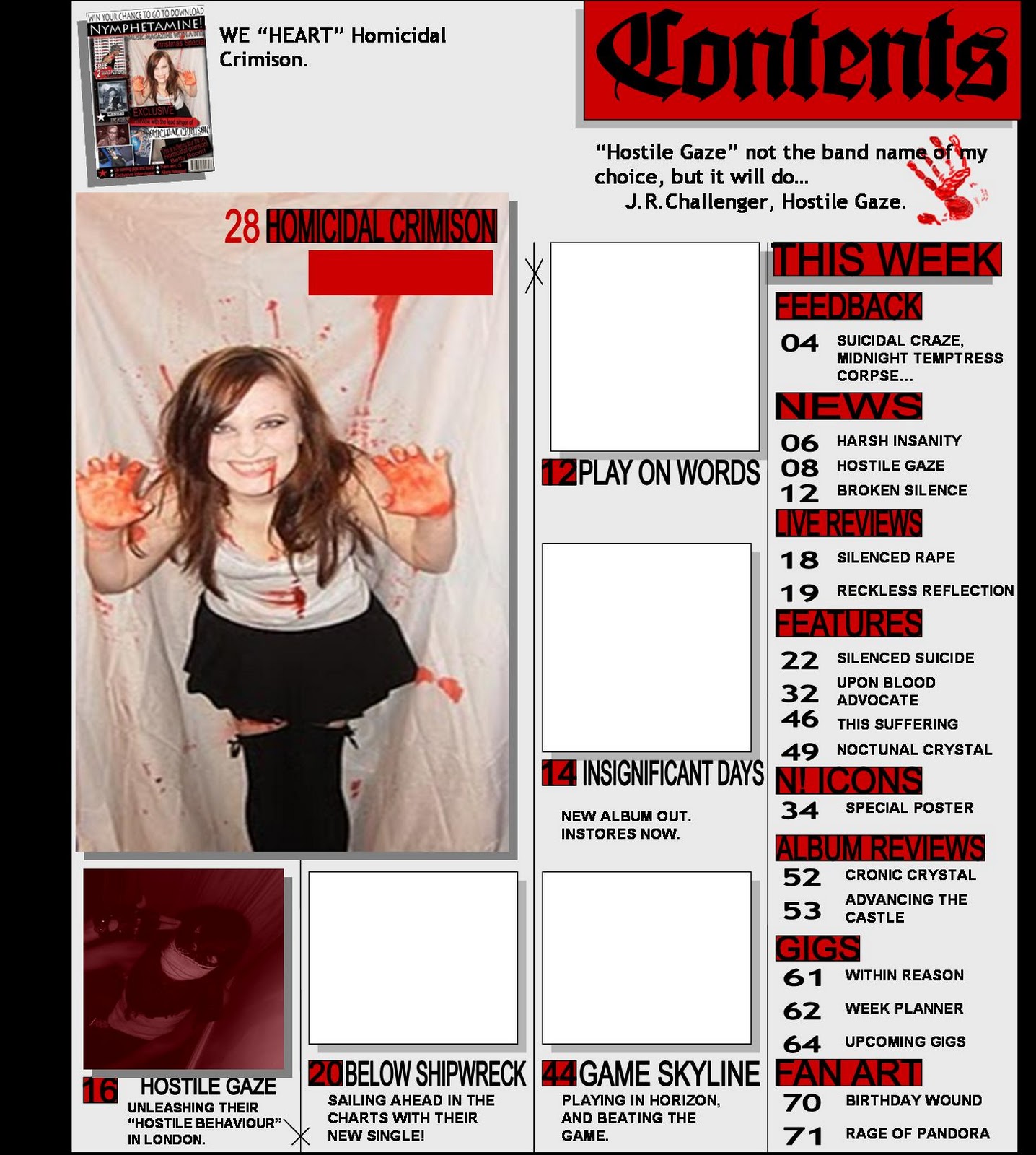
On my music magazine front cover there is a main image. I think that the main image is an appropriate size.
 I think that the main image gives a clear image of what the story is presenting. I am pleased with the composition of the image; I have put the main image in the middle of the page and made sure that it is big enough so it doesn’t get obscured by anything.
 I have placed subsidiary images on my music magazine front cover. I have placed them on the left side going along down the side but I made sure that people would notice them. I think the subsidiary images are an appropriate size and they give a clear indication of what the story is representing.

Language

I have used strap lines on the front cover, I think I have only used two which is “WIN YOUR CHANCE TO GO DOWNLOAD” and “EXCLUSIVE interview with the lead singer of HOMICIDAL CRIMISON” I am thinking of adding several more. The strap lines give a clear indication of the contents of the magazine, for example “EXCLUSIVE interview with the lead singer of HOMICIDAL CRIMISON” indicates that somewhere in the magazine, there will be a page on an article with the lead singer of “HOMICIDAL CRIMISON”.
  I think that the language is informative and entertaining, I have used the literary term of “personification” on the sell line “MUSIC MAGAZINE WITH A BITE”. I think the punctuation and spelling is accurate.
   I have used two fonts, the size of the fonts are appropriate. Yes I have used a consistent colour scheme has been used for the strap/sell lines. For example on some of the texts, I did the text white and put a black box around it to make it stand out and on some I just reversed the colours.

Layout and design

I think the layout and design of my music magazine is clear and well organized as, there are no objects obscuring certain aspects of my music magazine. I think it is appealing to the reader, (well I hope it is.)

Strengths

I think the 3 strengths of my music magazine are the photographs that I took, I am pleased with them and I think they have turned out quite well. Another strength I think is the layout and design of it as it is clear and organized. And thirdly the colour scheme is appropriate.

Targets for improvement

Overall I am pleased with my music magazine cover; however the one aspect which is letting it down is the font of the masthead “Nymphetamine”.


Content pages that i like :)


I Like this Music Magazine content page because the layout is interesting and stands out. The main image is very good and the subsidary images are of good quality.
As for the 'content' included on the content page, it will attract the readers interest. My favoutite thing about this contents page is that it's kept simple and the producer who created it kept to the colour scheme which is good. ^_^
I like this Music Magazine content page because the layout of the text and images is set out in interesting ways. I would comment on the main image on this contents page, however there is several subsidary images and they are all different, they look as if they are well composed and planned well.
Once again my favourite thing about this contents page is that it is nice and simple, i particually like the colour scheme of blank and white. :3

Friday 11 February 2011

TWO PAGE SPREAD - DRAFT 8


On the eighth draft of my two page spread I changed the font of the title of the article, behind the title I placed a black and white box to create a contrast, I also included a the date, page numbers and a little logo at the bottom of the page for magazine, I also included a couple more pictures and applied drop shadow to them.

Thursday 10 February 2011

TWO PAGE SPREAD - DRAFT 7


TWO PAGE SPREAD - DRAFT 6


On the sixth draft of my two page spread I changed the font of the title of the article, and changed the position of the images and the pull quote

Wednesday 9 February 2011

TWO PAGE SPREAD - DRAFT 5


TWO PAGE SPREAD - DRAFT 4


On the fourth draft of my two page spread, I included a sell line.

Wednesday 2 February 2011

TWO PAGE SPREAD - DRAFT 3


On the third draft of my two page spread, this is basic conventional layout of my two page spread article, I decided to remove all of the pictures from behind the text which made the text easier to read, I put an outline colour on the text, and I changed the colour of the title of the article.